
Revamping a prestigious wine and alcohol brand with immersive, user-centric ecommerce.
See Live Website
Product Design
Interaction Design
Motion design

The Challange
Alcohol sales is a very competative market. Besides direct competitors, the market also includes big grocery chains, and e-commarce giants.
Out challange was to bring the "Haturki" brand and website to be a leader in this market.
insights
Project goals
improve the user expirience
Our main goal for the project was to improve the overall user expirience in the website, improving navigation, interactions, and suggestions.
increase revenue
By improving the user expirience, we are also aiming to increase the clients revenue helping to guide the user, and ease his purchasing expirience.
user & Competitive Reaserch
We reasarched direct and indirect competitors, and gatherd sales data from our client.
Competitors dont focus enough on e-commerce
Our direct competitors in the alcohol sales market were not putting as much emphasis on user expirience as some of the bigger e-commerce sites.
customers prefer a down-to-earth terminology
Our clients prefer more basic temrs regrading our products. we should use less technical terms and more "taste and feel".
our users LOVE combo deals
We knew local clients loves deal, but we were still surprised by how much. We should put a big emphasis on highlighting combo deals .
the expirience
wireframing
We began by wireframing the website, considering ways we want do direct the user twords certain items and goals.

User experience
Some of the features and interactions we used to improve the ux and increase sales were:
Smart cart sales suggestions
When a user adds to cart an incomplete combo deal he will get a notification about it, and a way to add relevent items directly from the side cart.
sliding Product Bottom bar
While scrolling a long product page, a bottom-bar with the product name, price, and add-to-cart button will slide up and stick to the bottom of the viewport.
design
user interface
The design proccess focused on using color and visual cues to improve the users expirience and ease of use, while putting an emphasis on the new brand language and color throughout the website.


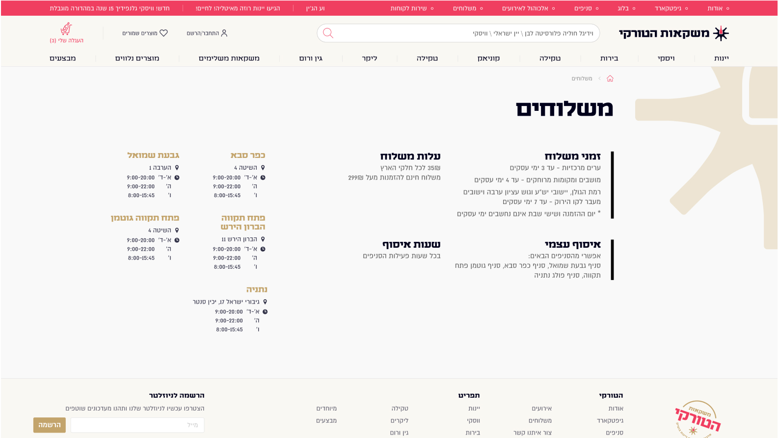


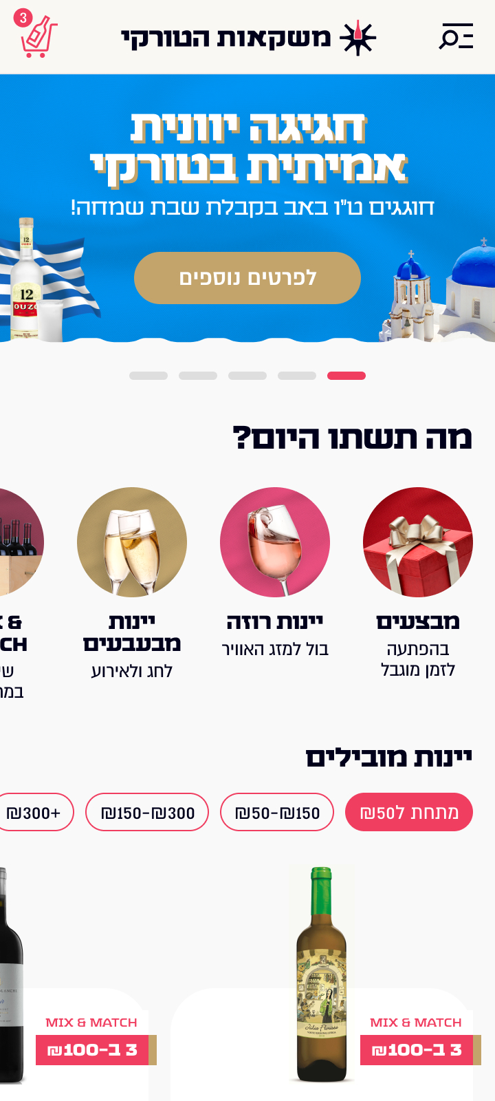
Mobile
As web usage on mobile is overtaking desktop usage, and is only increasing every year, we had to make sure our mobile expirience as as good and polished as the desktop one.


Micro interactions
We put a lot of effort into using interaction design to our advantage, using animation and micro-interactions to emphasize certain elements and actions to the user.
The item component
We wanted to make our items the highlight of the website. We made their design fit the items on sale, and made the add-to-cart button pop with a fun animation.
carts and hearts
We used micro interactions to increase user engagment, both in the cart icon (when hovering and while adding an item) and the heart icon.
Read other case studies
Learn more about my work with these projects:

Newcognito
Lorem ipsum dolor sit amet consectetur. Ipsum vitae nisl a adipiscing urna cursus. Ultricies arcu ipsum et vitae.